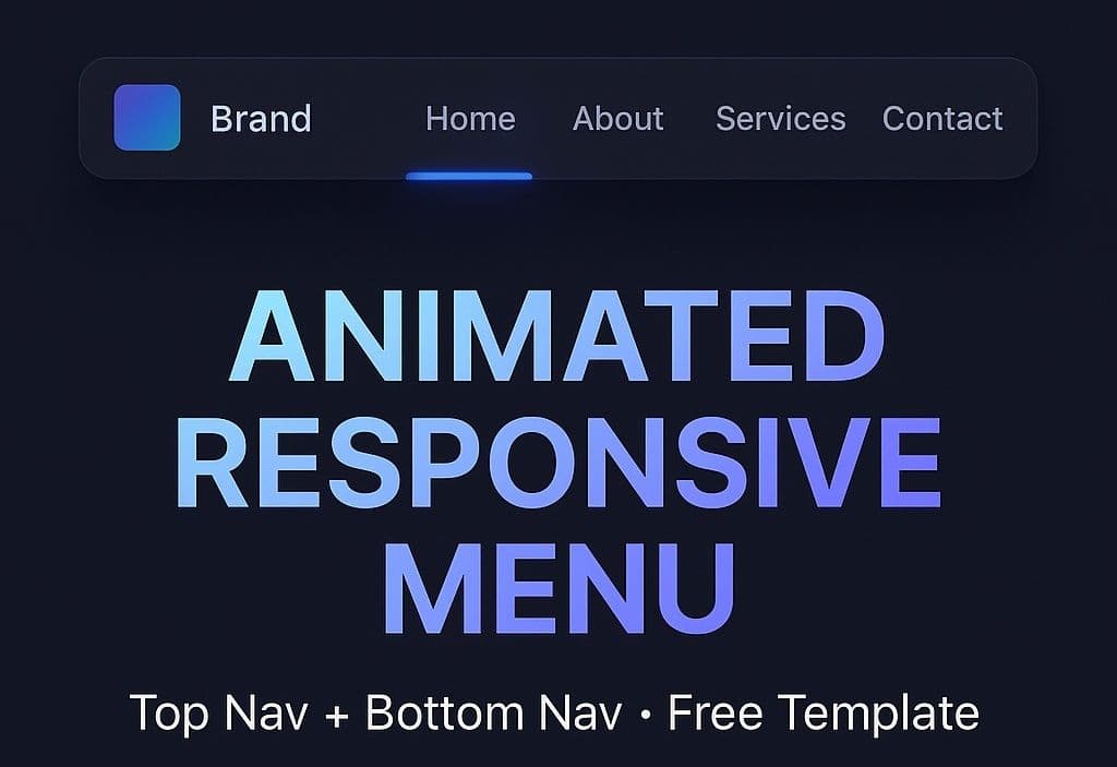
Animated Responsive Menu (Free) — Desktop Mobile
A lightweight, framework‑free menu you can drop into any site. It switches between a desktop top navigation and a mobile bottom navigation with a smooth, floating indicator.
What’s included
Free
- Source code and assets
- README with setup & deploy guides
- Lifetime updates to this template
Updated 10/8/2025
Template details
Docs: Full instructions for editing labels, links, icons, colors, and breakpoints are in the project’sdocs/folder (readme_animated_responsive_menu.mdand a PDF).
Highlights
- Two menus, one config
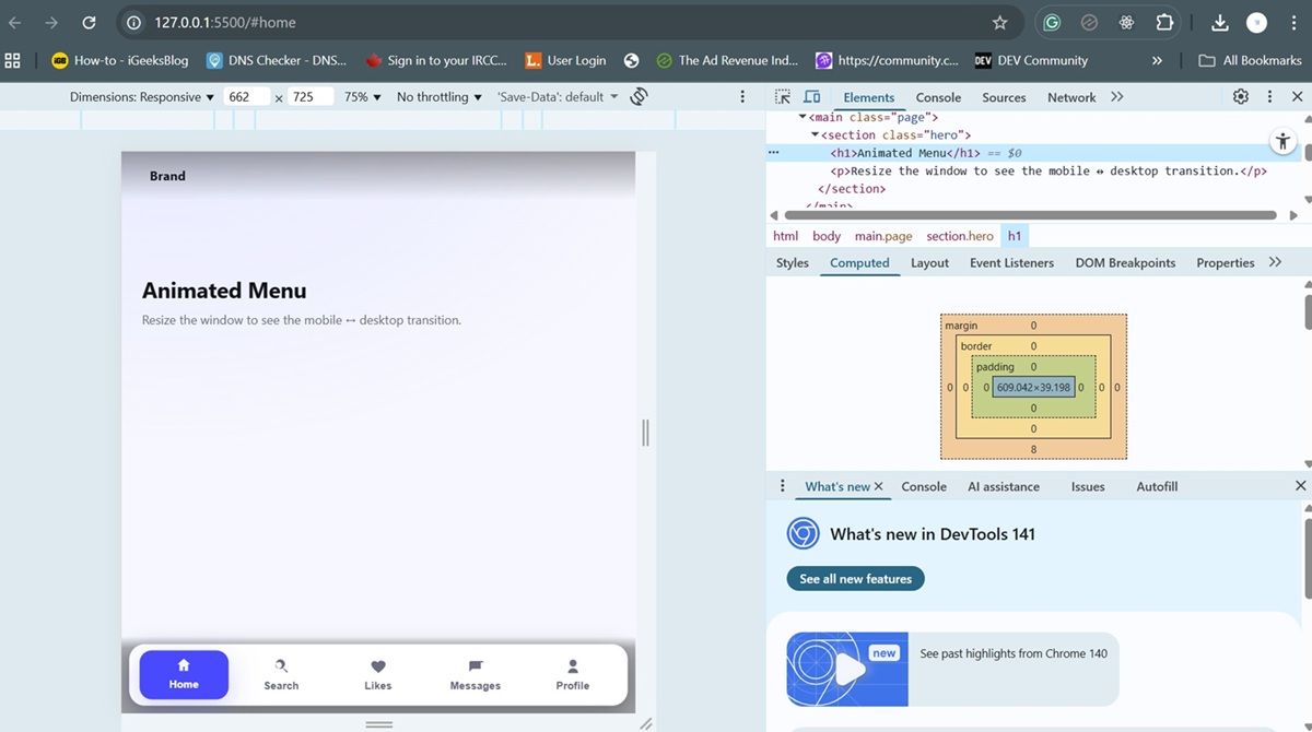
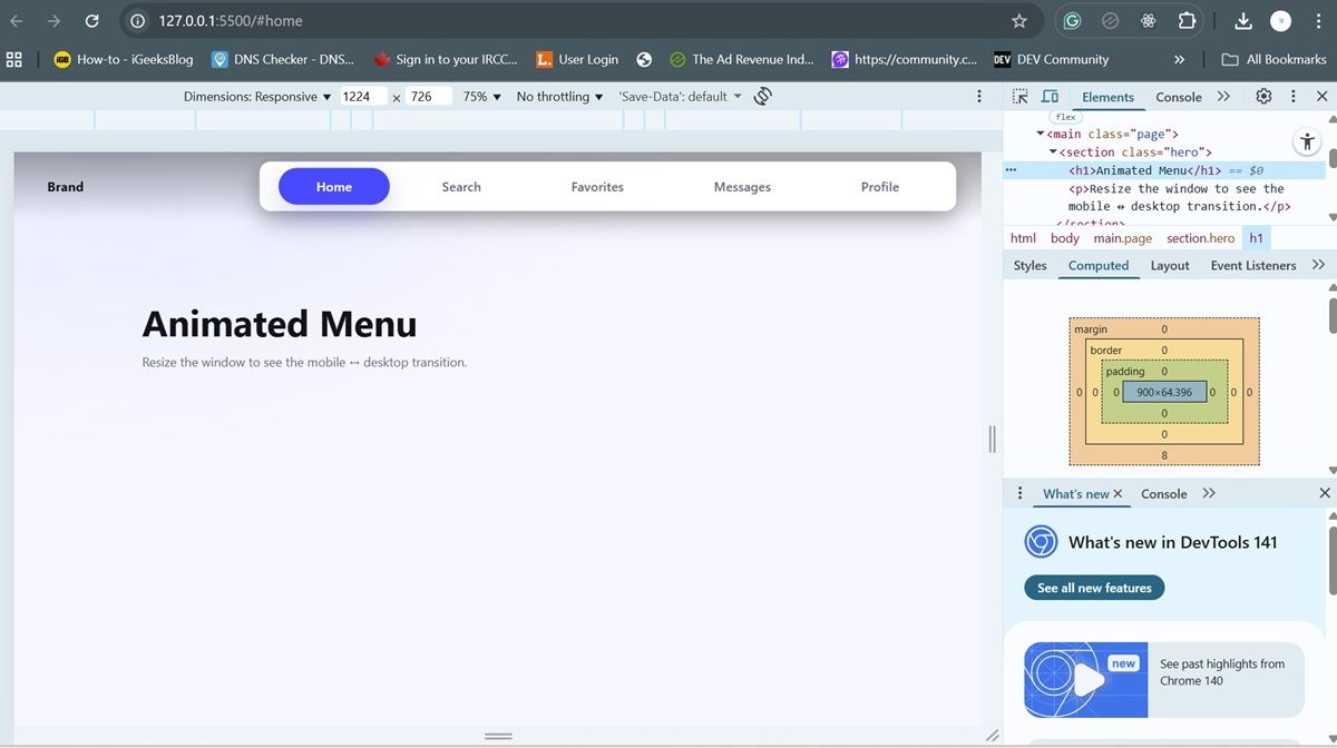
Desktop uses a top bar; phones show a bottom bar with icons. Both share the same routes (Home, Search, Favorites, Messages, Profile) so your UX stays consistent. - Floating “pill” indicator
A subtle glassy highlight slides under the active item. It repositions on click, keyboard activation, resize, and hash changes. - Mobile‑first, fully responsive
CSS media queries swap layouts at 900px. The bottom bar is thumb‑friendly with clear icons and labels.
- Accessible by default
ARIA labels,role="tablist"on mobile, focus states, and keyboard support. Reduced motion users are respected viaprefers-reduced-motion. - Themeable via CSS variables
Edit colors, radii, shadows, and animation timing in:root— no build tools required. - Hash deep‑linking (optional)
Routes like#searchor#messagescan set the initial active tab. - Tiny footprint
1 HTML + 1 CSS + 1 JS. Clean, commented code you can learn from.
What’s in the zip
index.html → Markup for desktop top‑nav + mobile bottom‑nav
style.css → Styling, themes, layout, and responsive behavior
script.js → Indicator positioning + activation logic
/docs/
  ├─ readme_animated_responsive_menu.md
  └─ Readme – Animated Responsive Menu.pdf
How it works (quick tour)
- Desktop (≥900px): shows a top nav with text links. A hidden
<span class="indicator">element is absolutely positioned under the active link. - Mobile (<900px): switches to a bottom nav with SVG icons + labels. The same indicator animates between items.
- Script:
script.jscalculates the active item’s bounds and moves the indicator using transforms and width updates. It listens for clicks, keyboard events,resize, andhashchange.
Customize it
- Items (labels/links/icons): edit the lists inside
index.htmlfor.top-nav(anchors) and.bottom-nav(buttons + SVGs). - Colors & look: tweak CSS variables in
style.cssunder:root(e.g.,--accent,--text,--card,--ring). - Breakpoints: adjust the
@media (max-width: 900px)rule to change when the layout flips. - Motion: edit transition durations/easings or rely on
prefers-reduced-motionto disable heavy animation.
See docs/readme_animated_responsive_menu.md for step‑by‑step changes (with code snippets) and the PDF version if you prefer visuals.Quick start
- Unzip the folder and open
index.htmlin your browser. - Replace the menu labels/links and SVGs with your own.
- Adjust colors in
style.css. - (Optional) Use routes like
#profileto set an initial active tab.
Who this is for
- Students who want a clean, modern menu to learn from and reuse.
- Makers who want a polished nav with minimal code and zero dependencies.
- Anyone building a demo, portfolio, or mobile‑first site.
License & attribution
This template is free for educational use. If you extend it, a link back is appreciated.